


Amorphophallus
2021Description
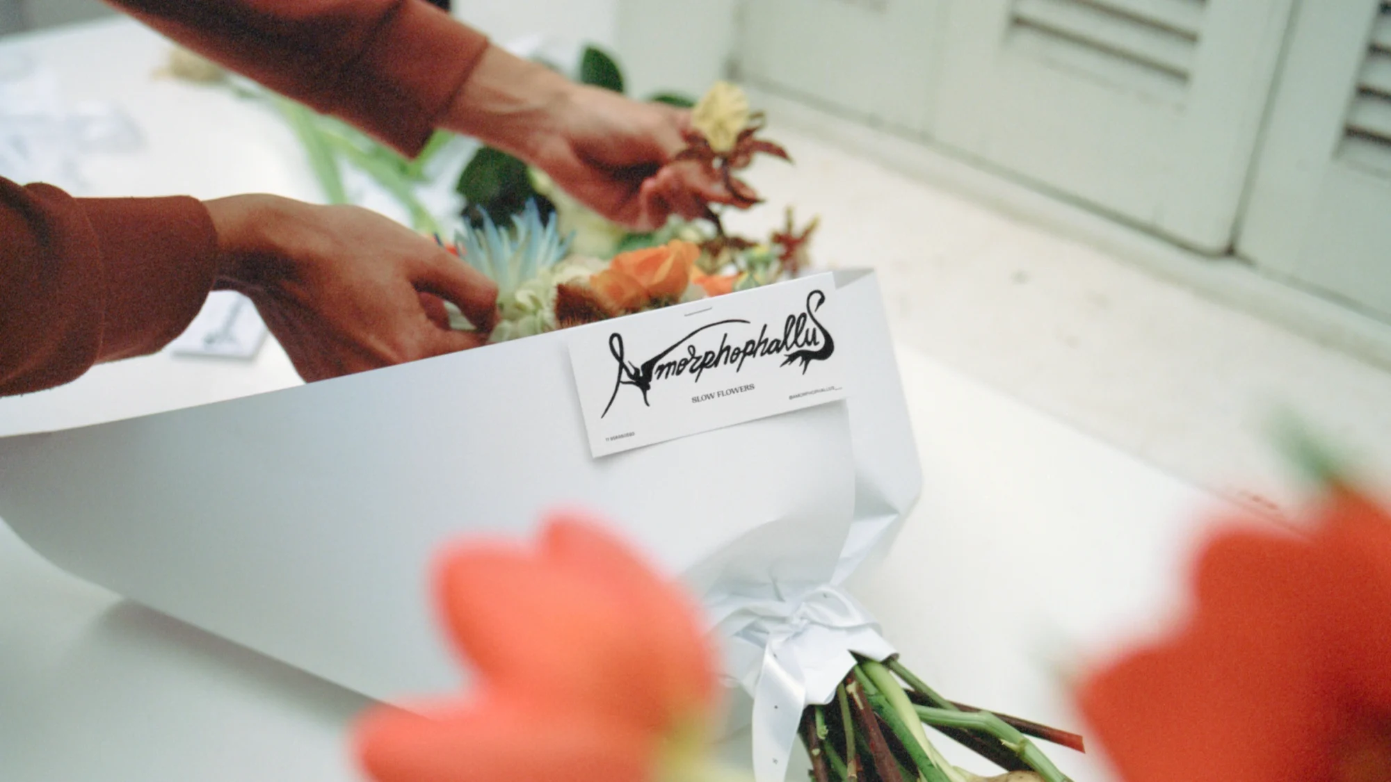
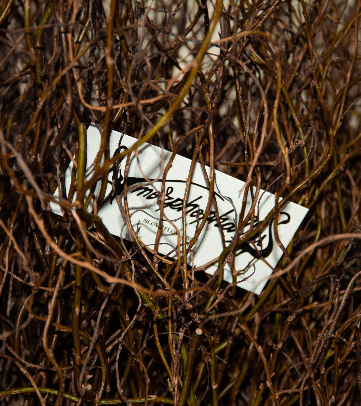
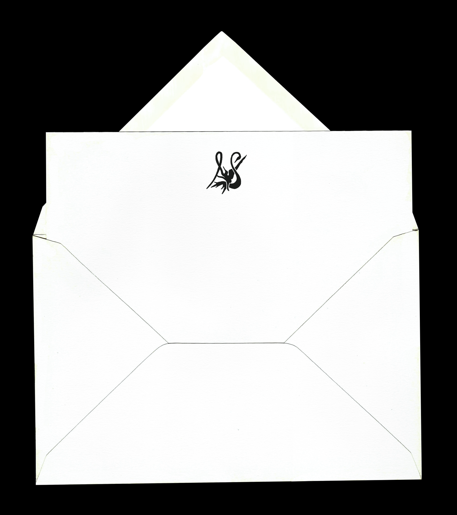
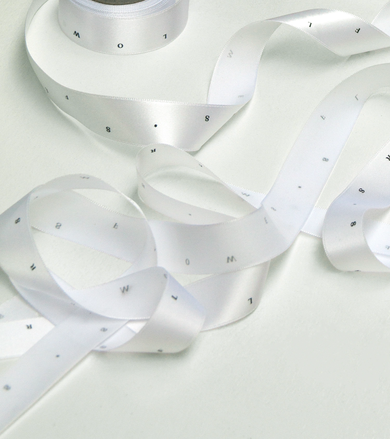
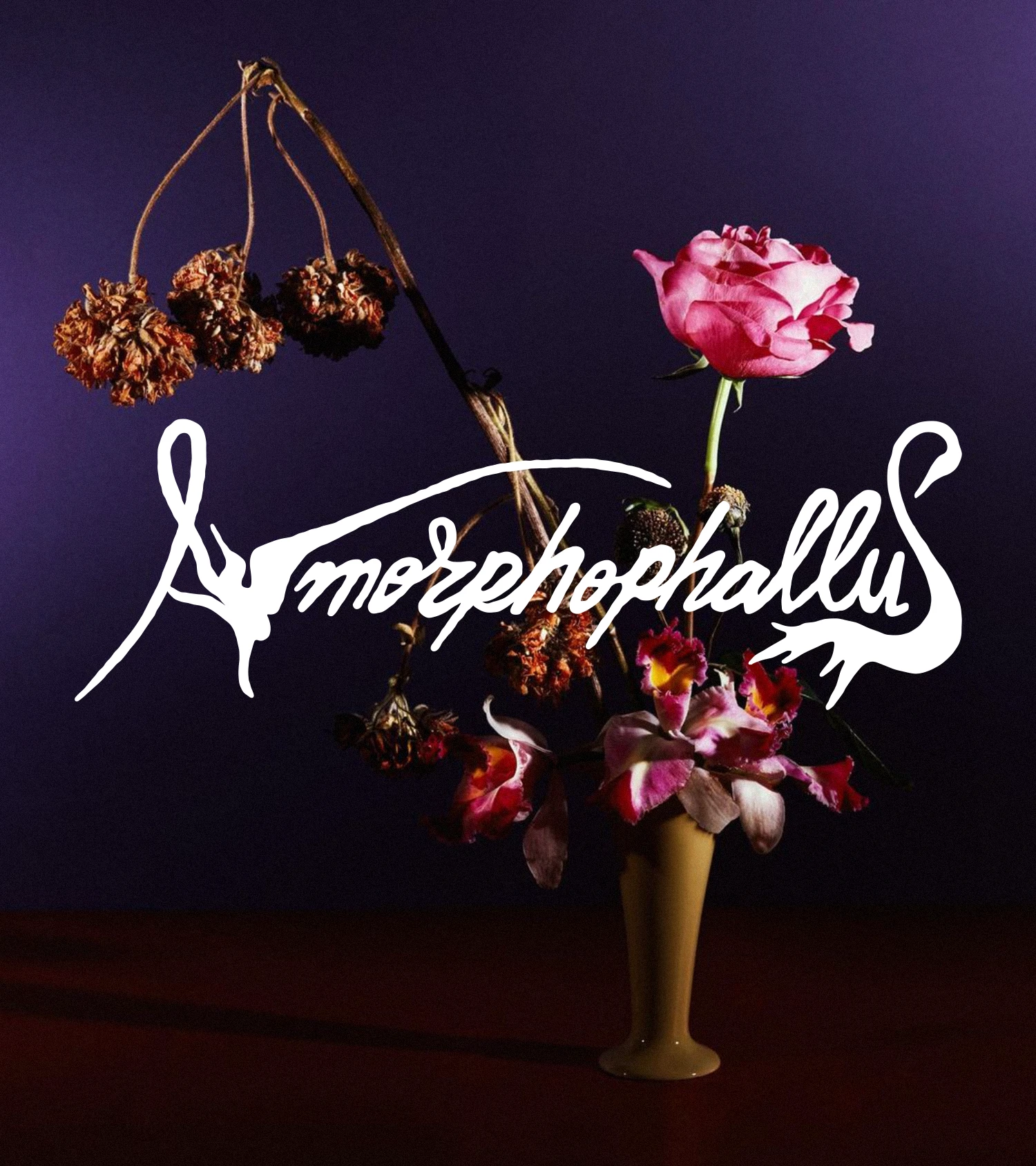
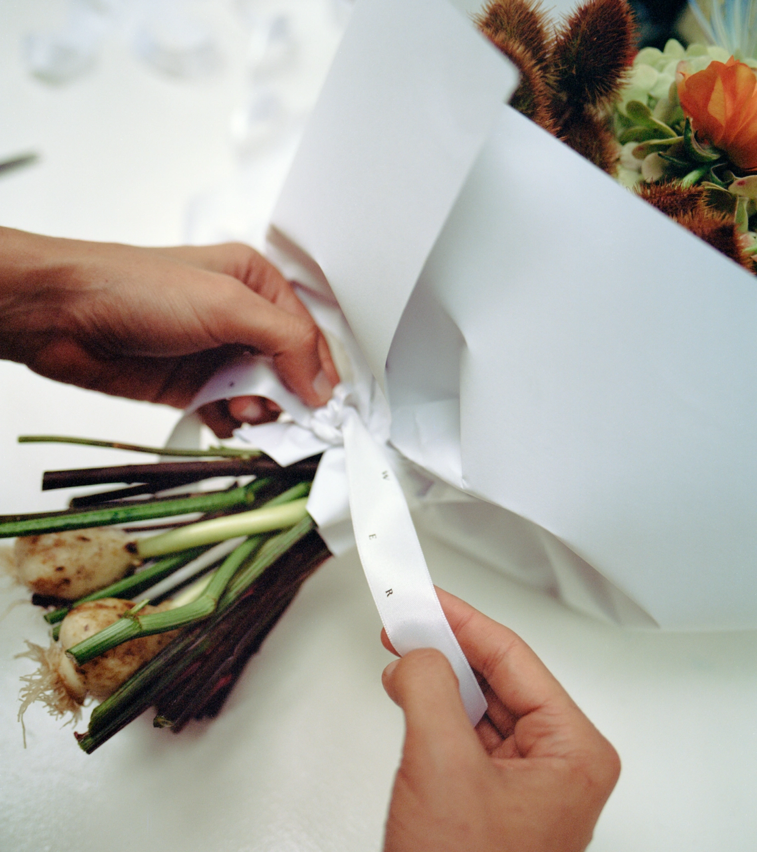
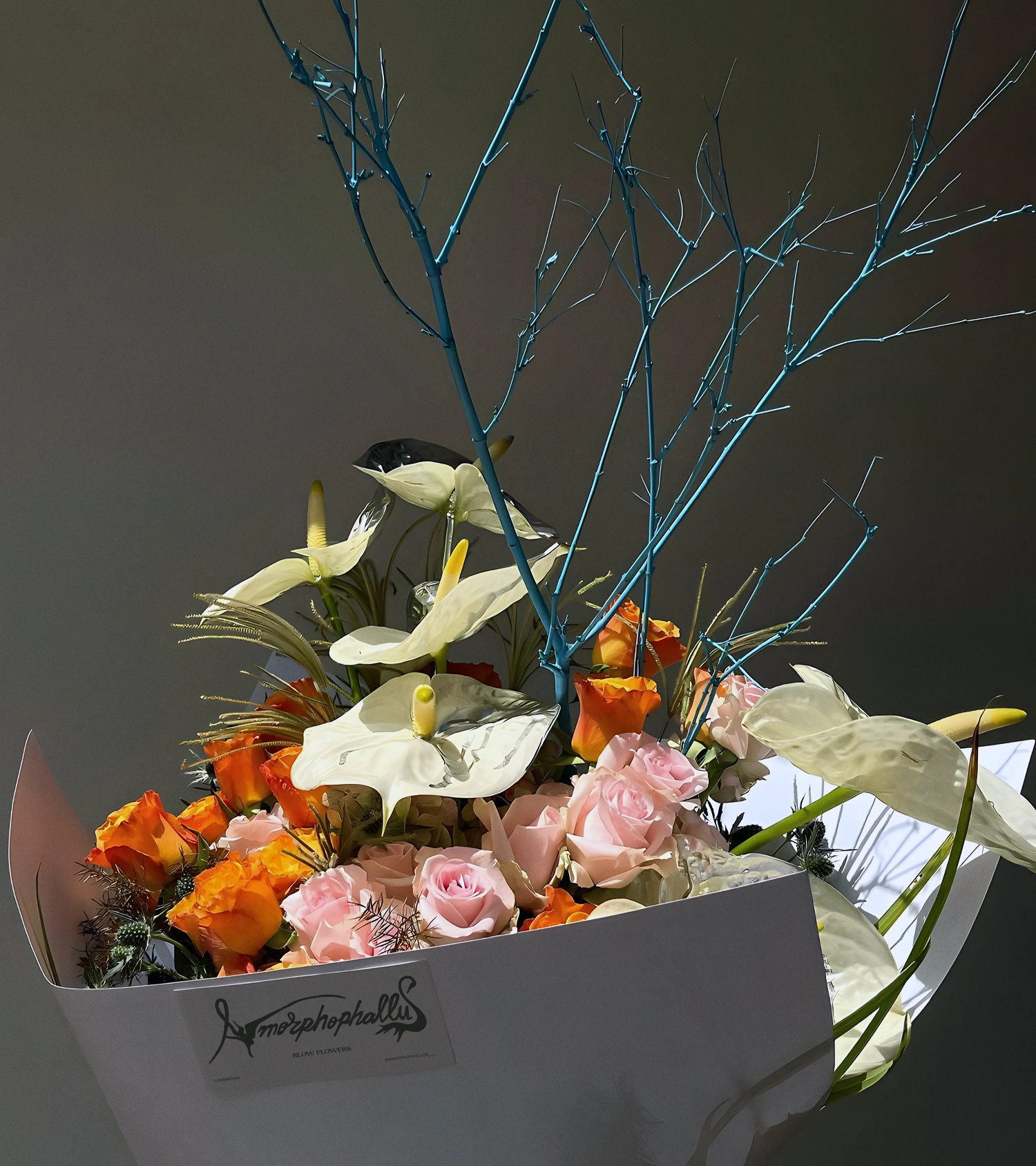
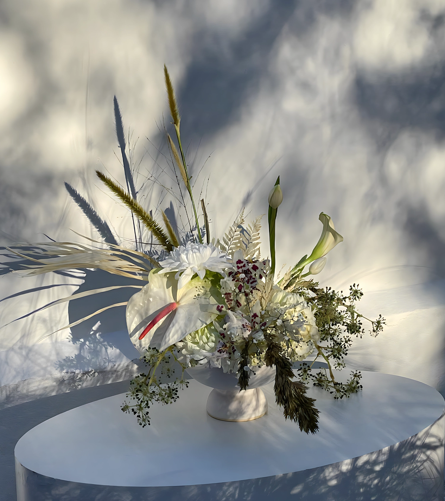
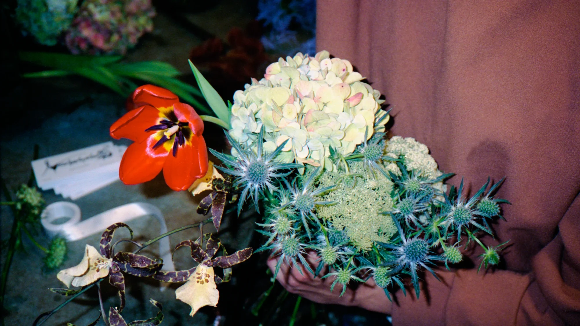
Amorphophallus is a flower studio that services events and personalized, special-delivery arrangements. Unlike conventional flower shops, they are known for their unconventional bouquets that are unafraid of taking risks. When creating the visual identity for the brand, the premise was to conceive something timeless that could dialog with a wide, diverse audience, that could be strong but with somewhat gloomy overtones. For the logo, many tests were made until arriving at a final design, with swans becoming the A and S, giving shape and meaning to the brand. The initial draft was drawn by hand and then vectorized and carefully adjusted, keeping the original finish but securing balanced proportions. In communication, the logo unfolds into graphics and is supported by plenty of blank space in black and white layouts. The stationary, mostly white, is as classic as it is current, present just enough to highlight the beauty and singularity of the flowers.
Scope
Visual identity
Packaging
Credits
Creative direction
Beatriz Dórea
Graphic design
Beatriz Dórea, Daniel Junqueira
3D
Pedro Sena Fonseca
Soundtrack
Fernando Pereira Lopes
Campaign photography
Gabriela Schmdt, Conrado Pedroso
Case study photography
Beatriz Dórea, Isabela Vdd