


B Botânica
2020Description
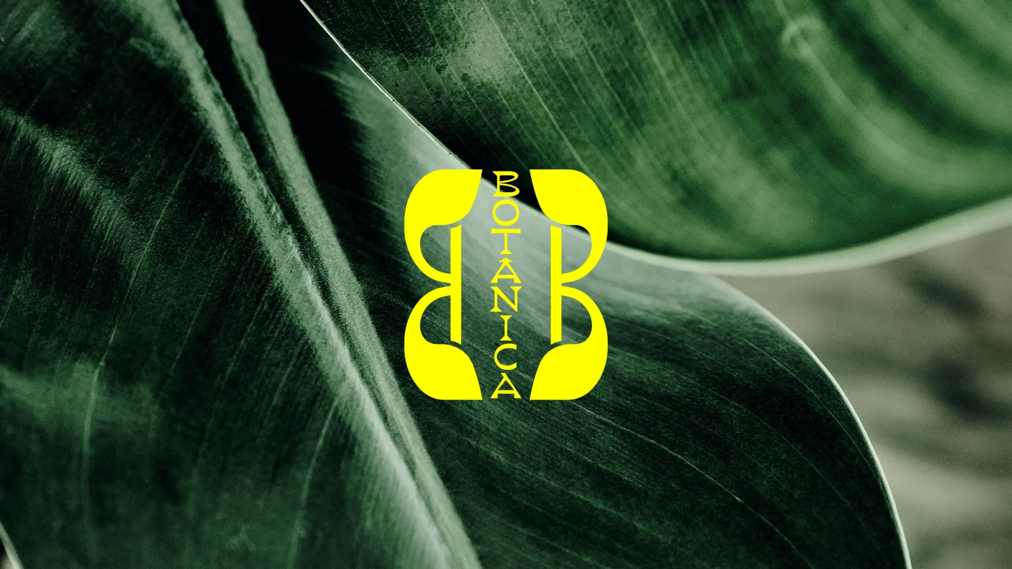
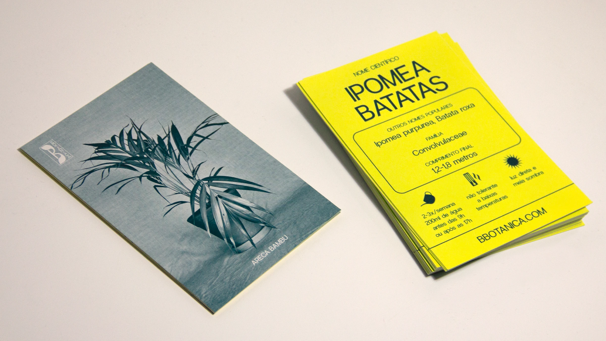
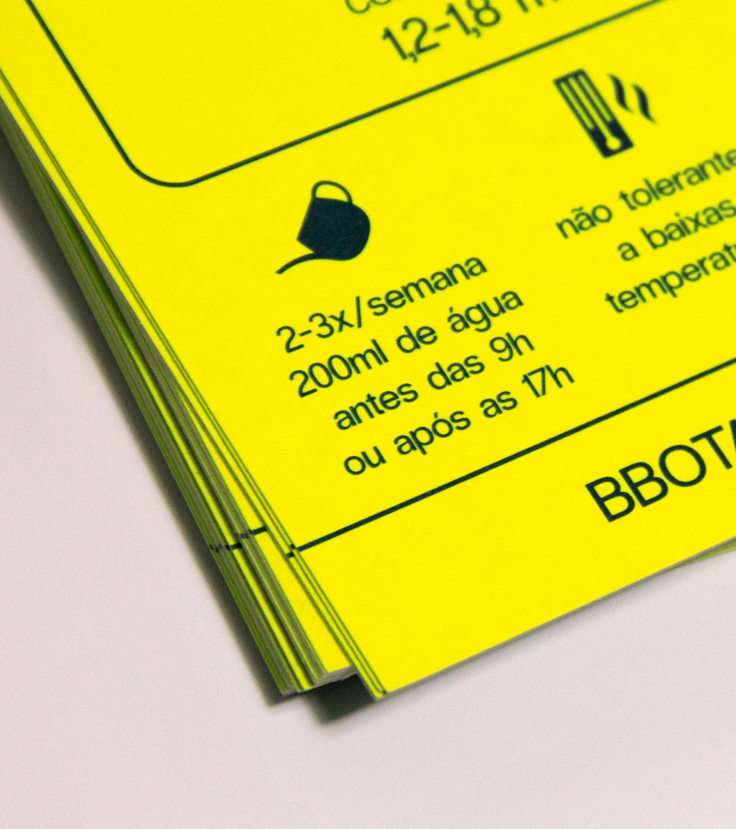
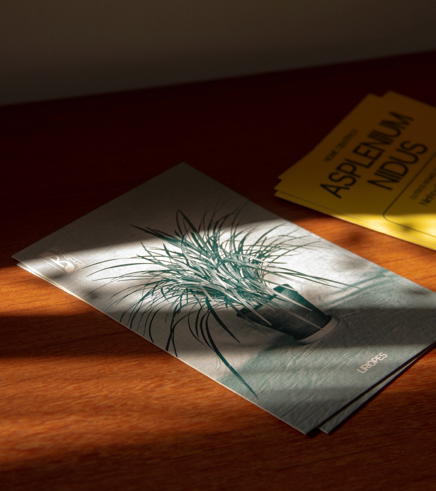
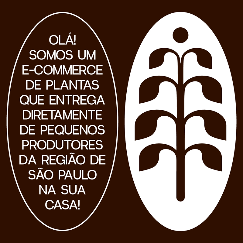
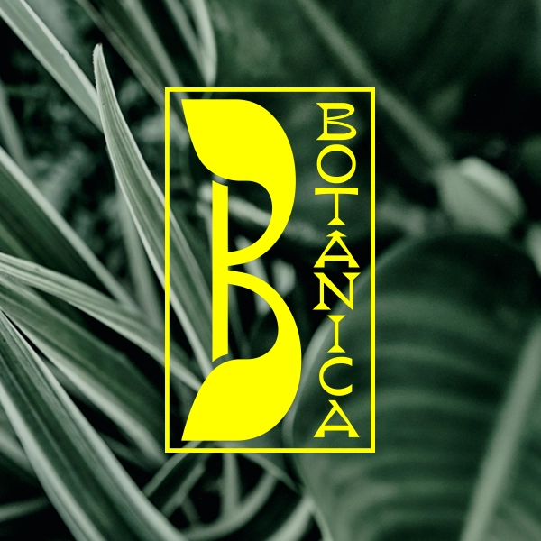
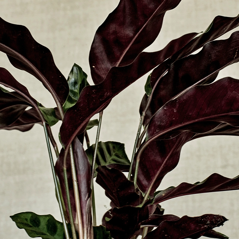
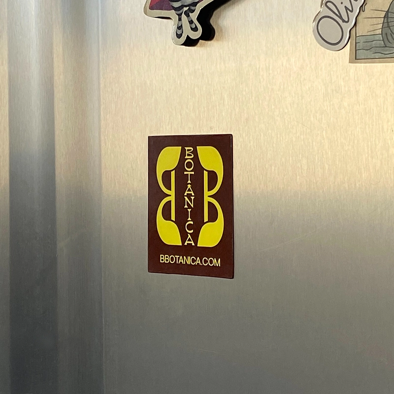
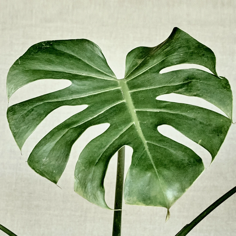
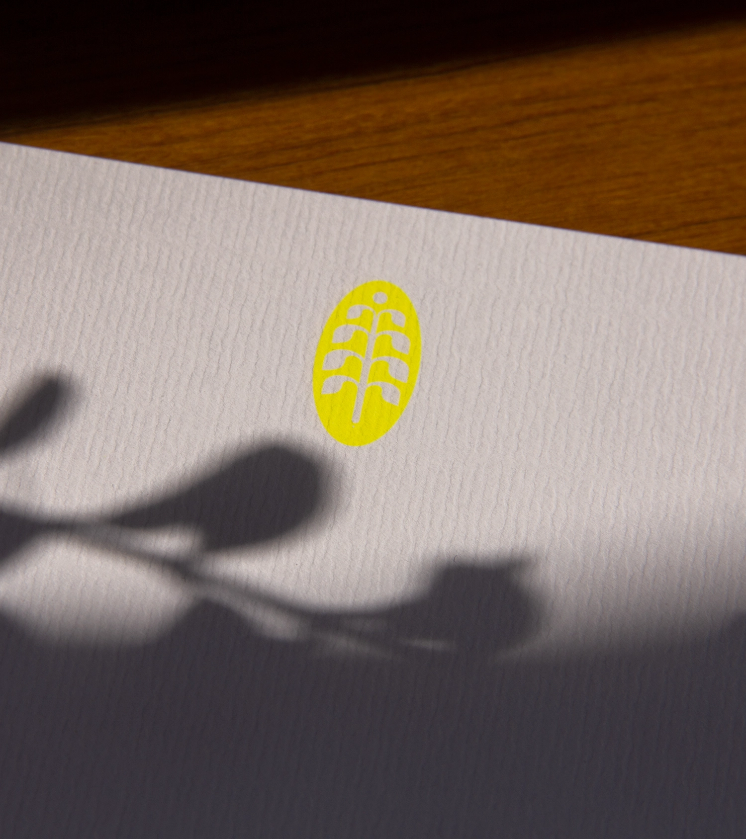
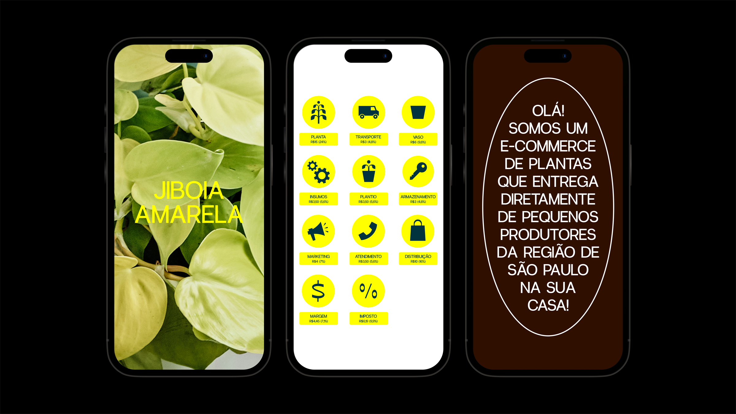
B Botânica emerged during the pandemic seeking to bring more green into the homes of São Paulo residents. The online plant store marked the moment with its art-nouveau inspired aesthetics, while deliberately avoiding a vintage appearance. With an irreverent and daring attitude, the brand’s visual identity is maximalist: the ornaments, the mixture of fonts, the extravagant compositions, the color palette, the still life photos, everything combines in a look that hardly goes unnoticed. For the logo, different application formats were created, generating a family of possible compositions that also sets the tone for the layouts, loaded with decorative elements, frames, stamps and rounded edges. Contrasting the detailed design with a nostalgic air, the color palette features a super vibrant yellow, which stands out alongside the green, brown and white, reaffirming the digital character of the brand. Yellow also prevails in details for stationery prints, more muted in the cards, and uninhibited as a background color in plant care postcards.
Scope
Visual identity
Packaging
Web design
Credits
Graphic design
Beatriz Dórea
E-commerce
Vnda
Still photography
Philippe Kliot
Case study photography
Beatriz Dórea